As part of the Google UX Design Certificate, I created an app to help users identify and care for their home plants.
Using the design thinking framework Empathize → Define → Ideate → Prototype → Test I designed both the app and a responsive website to introduce it to potential users.
My task was to understand plant owners’ challenges and turn insights into a user-centered solution. For example, I mapped user journeys , created personas, developed the product from wireframes to interactive prototypes, and iterated through usability testing, and accessibility refinements; resulting in a functional, engaging app with practical plant-identifying tools.
.png)
Empathize & Define
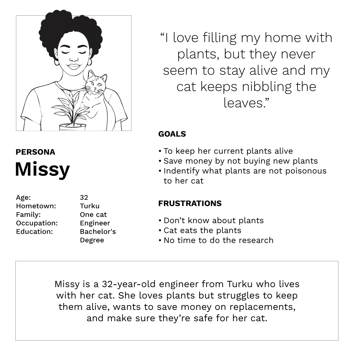
As this was a course project with no real user data or interviewees available, I used GenAI to simulate early user insights and combined those with a competitive analysis of existing plant-care apps.
While AI-assisted insights aren’t a substitute for real research, this approach allowed me to practice forming problem statements, goal statements, personas, and a user journey map, along with simple storyboards and user flows.
These foundations clarified the core needs of the app and guided the direction of the design.
Problem Statement:
Missy is a 32-year-old engineer who needs a simple way to care for her plants because she has limited plant knowledge, a busy schedule, and a curious cat.
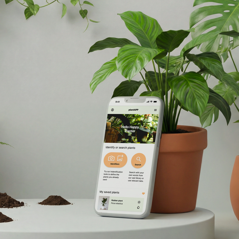
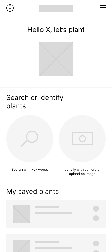
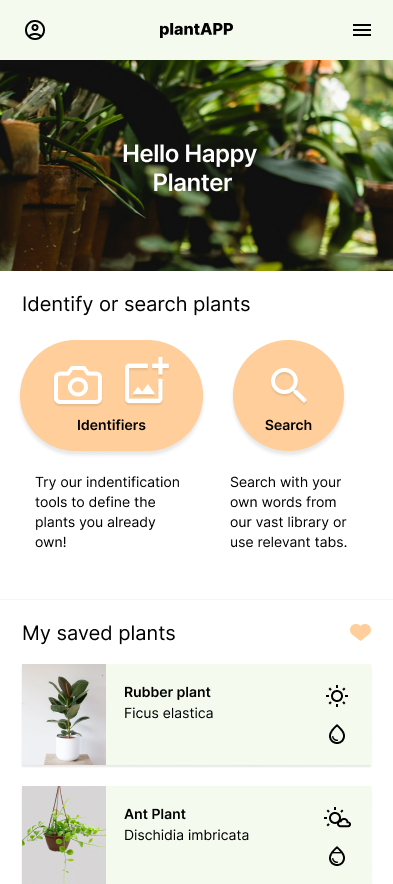
From wireframes to mockups
Here is the evolution of the home screen, from early hand-drawn sketches to low-fidelity wireframes and the final high-fidelity mockup. I explored several layout ideas, combining the strongest elements into one clear direction. The design was refined through AI-assisted usability testing and feedback from my close network, while considering clarity, usability, and accessibility. The UI evolved throughout the process as structure, interactions, and visual style were gradually improved.

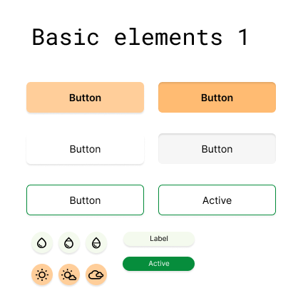
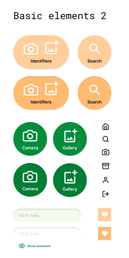
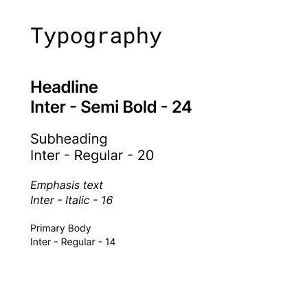
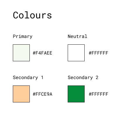
Simple Design System
I created a simple design system to keep the app consistent and easy to use. It includes four main text styles and a palette of core colors chosen for readability and contrast. The most common UI elements, including buttons with clear labels and icons, input fields, and icons, were designed to be intuitive and accessible.
The prototype
The high-fidelity interactive prototype demonstrates the core features of the app and the underlying user flows. The video walks through key interactions, including plant identification and navigation across the main pages, while also highlighting transition animations and different element states explored at this stage. These details help communicate how the experience is intended to feel in real use.
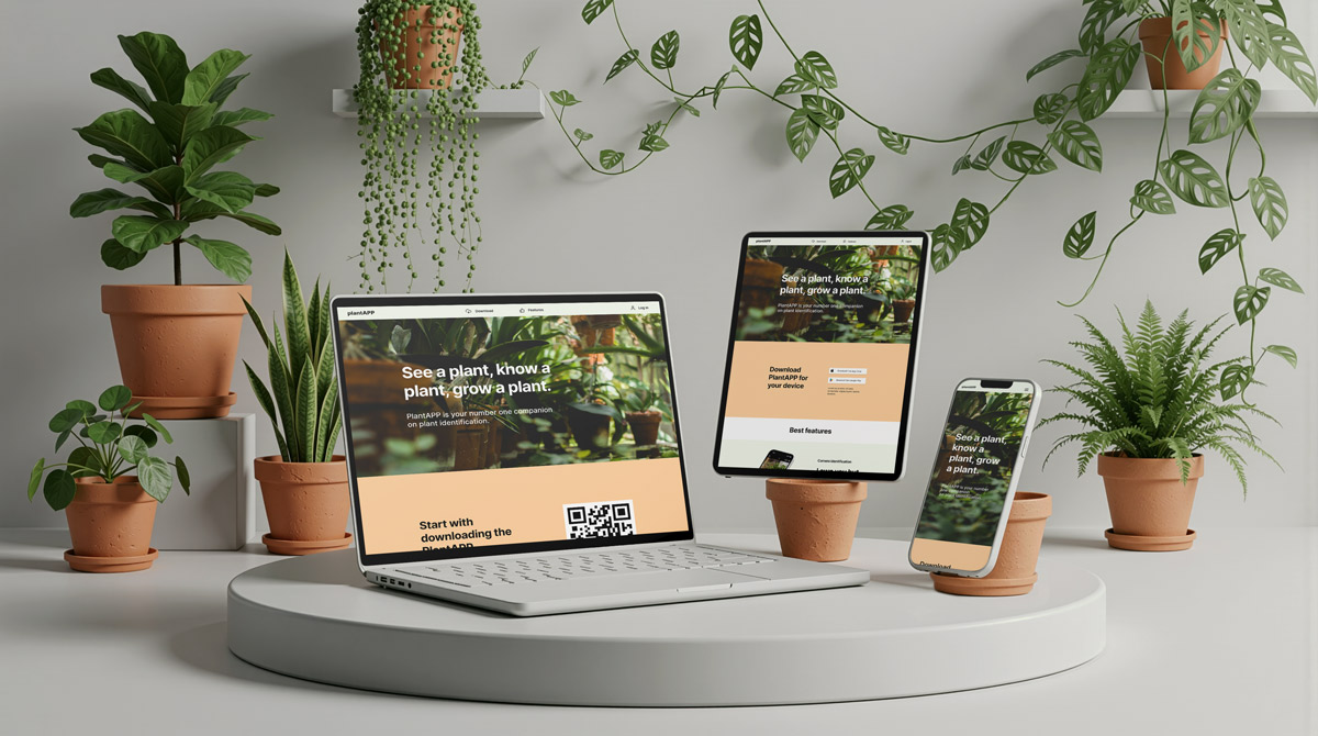
Responsive Landing Page
To support the app, I designed a responsive landing page that introduces the product, highlights its key features, and guides users to download the app. The page also allows users to log in to their account from the web, extending the experience beyond mobile. The layout adapts smoothly across desktop, tablet, and mobile screens, keeping the content clear and easy to navigate.